
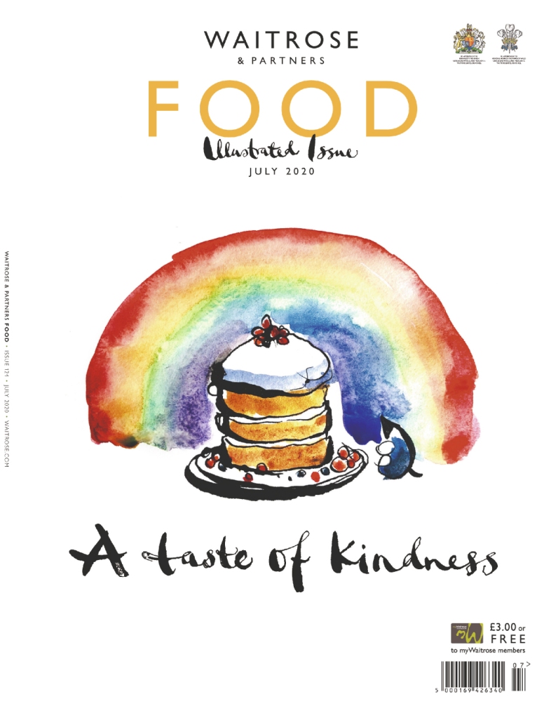
I emailed the Association of illustrators of which I am a student member and asked it they had any advice for those wanting to specialise in food illustration. Fortuitously, they mentioned this latest illustrated issue of Waitrose Food Magazine which due to COVID19 has a much larger illustrative content than usual. Also, as luck would have it they were also running a cover illustration competition! I due usually pick up this magazine on my trips to Waitrose but because of the current situation we have been getting most of our groceries nearer to hand.


A I have mentioned previously, it was work done by Emma Dibben for Waitrose that was instrumental in getting me to take up illustration in the first place, so I was really keen to see the styles and techniques of other illustrators that were featured in this specific edition.


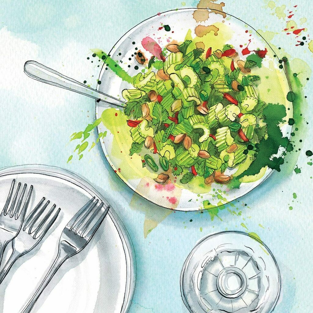
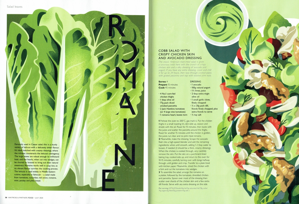
The magazine featured many different illustrators but the four above most represented either the way I mainly choose to work or techniques I would like to master. All of them conform to what I would recognise as “Waitrose Values” i.e. quality, freshness, sustainability and seasonality. Owen Gatley’s technique is rather different seeming to be worked totally digitally but it still conforms to the values and has a very dramatic presentation style.

For my own page design I chose this picture previously featured in “Delicious Magazine” because I loved all the beautifully coloured “Heritage” tomatoes. If you look at it one can see how carefully they have been arranged so that the colours are evenly spread across the tart to improve the overall image. I also thought it was the kind of dish that would be of interest to Waitrose Magazine and its readers – fresh, tasty and wholesome.

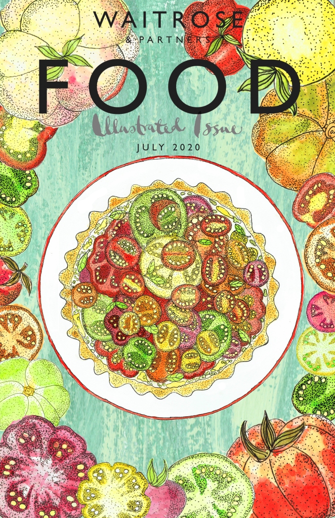
Above are my two finished cover designs. The tomato and ricotta tart and the tomato/tomato slices were painted separately in watercolour and fineliner pen and were assembled together with a gouache background (to resemble a distressed kitchen table) and the title page on Adobe Photoshop. I made the two designs to convey both a “restrained” image, giving the tart a primacy and one with the theme of abundance and colour.
So far I have had a lot of appreciative comments about my designs and a “Like” from Waitrose’s Art Director on Instagram! The closing date for the competition is 30th July 2020.
Sunday Nov 8th 2020

The results have been published. Unfortunately I didn’t win or make the runners up. In critical reflection that is I think because the central image of the flan is perhaps too much like the original photograph, although I did try to ensure that I rearranged my tomato slices significantly. However, looking at the ones that were chosen I feel confident that my execution of the painting and the construction of the overall image was more than competent enough and fitted the brief well.
